We’ve got to make content models easy to read. It doesn’t matter who creates the content model, your target audience is everyone. Why? Because when you set content free, you have no idea who, where or when, somebody is going to pick it your work up and run with it. Like plain language, content models must be “communication your audience can understand the first time they read it”. Don’t make them think. Don’t make them squint. Don’t make them second guess your work. For content to get everywhere it needs to be, we have to make it easy to read. So how do we do that?
We need a common language for expressing readable content model diagrams. A common language brings consistency and spreads familiarity amongst practitioners. As luck would have it, we can reach back and borrow from smart people that have already walked this path. We can reuse one of many widely accepted design modelling languages to depict content models and bring visual clarity. We’ll get into these later.
But for now, small simple steps. Let’s start with boxes and lines and put a few ground rules in place to achieve consistency in the way we visually layout content models. Achieving diagram consistency is no small feat, but highly rewarding. With a picture being a thousand words, it’s important to follow a few guidelines (the cost) to make your models easier to read (the shared benefit). We are not going to leave this to chance, so below are a few diagram guidelines for content models to get us started.
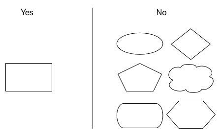
Pick a shape for your content types. Value boxes over anything else.
There is nothing as clear as a rectangular box. You can use ovals, circles, pentagons, hexagons or even squares. Nothing is a readable as rectangular boxes.
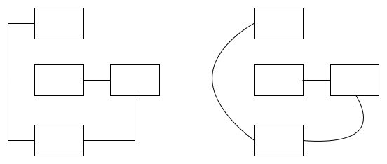
Keep your straight lines. Avoid diagonals and curves.
Sit up and keep your back straight. Sloppy, swishy, swirly lines do not make for effective lines of communication. Straight lines represent clear and concise relationships between content types.
You might be thinking, I kind of like those curves. So do I, but they do not scale. As the number of content types and relationships between them grows, the curves get old and difficult very quickly.
Do not cross the streams. Avoid overlapping lines where possible.
Although it’s not always possible to do so, try to reduce the number of overlapping lines with your content models. Overlapping lines introduce visual complexity and reduce readability.
All three diagrams carry the same meaning. Some of easier to comprehend than others. If you have to cross the streams, make the direction of overlap clear. That’s the difference the between Option 1 and Option 2. Better still, take Option 3 and don’t overlap at all.
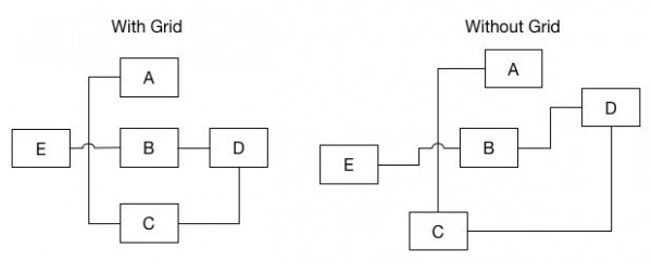
Work to an invisible grid. Maximise symmetry and white space.
Grids bring visual order to what is seemingly a disorganised arrangement of things on screen. Symmetry and white space improve the readability of diagrams by not letting people think about how visual elements are best displayed.
Grids also take away that arrangement burden and gives each content type compass points to connect to other content types. This vastly reduces behavioural complexity by helping you position content types.
Look at content type B in the grid based content model diagram. It can has A, D, C and E arranged in the compass pass positions. Layout is simple and known compared to not having a grid like the content model on the right.
Use a well-known visual language for content modelling. Don’t roll your own.
It’s not easy to create your own visual language that everyone buys into and understands. So don’t do it. Use a well-known visual language to express the elements of your content model and stick to it.
The Unified Modelling Language (UML) and Entity Relationship Diagrams (ERD) are two popular visual languages we could use to depict our content models. UML is widely used within software design and ERD for database design. Why not beg, borrow and steal decades of model thinking to fast track our understanding of designing for structured content? No reason, so let’s do just that.
Our recommendation is to use the bare minimum of UML. It’s simple, clear, concise and does not require a PhD to understand it. We’ll introduce bits and pieces of UML as part of the design guidelines when we delve deeper into the relationship between content types. To be honest, we only need to incorporate a few things from UML that if we do it right, we’ll not even need to mention UML again. That’s the goal.
Break down big diagrams into smaller diagrams. One page, one module.
When a content model cannot fit easily onto a single page, break it up into smaller pieces. Do not shrink boxes and fonts to the detriment of readability. Resist that temptation and do the right thing. Content models can be broken down into highly cohesive groups of content types called content modules (a topic for a later day).
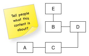
Each diagram should have a note describing its purpose.
Add a note to the diagram that describes the collective purpose of the content types making up the content model. Make the purpose of each diagram clear and concise for all readers.
Always use domain-based naming. Names should be evocative.
All names used within the content model should be directly plucked from the language of the business. Content types are information assets valuable to the business. Created by the business, for the business, with names that resonate with the business. Easy to say, difficult to do, but you’re the glue; no one else knows your business domain better than you.
Don’t let people think about how best to name things within your diagrams. Names should be consistent.
Adopt a naming convention for naming things. Software developers adopt naming conventions based upon the programming language, personal preference, team style guidelines, and so on. And things get religious quick. Circumvent the noise by pro-actively taking the most important first step to agree on a naming convention and then stick to it.
Here are a few different ways of naming the content type ‘Featured Article’:
1. FeaturedArticle
2. featured_article
3. featuredArticle
4. Featuredarticle
5. Featured Article
6. Featured article
All are valid. There is no wrong answer. However, the best answer is the one that increases readability by being consistent. So, you may decide (1) to be the best option for naming content types, and (3) for attributes and relationships in your content models. What’s important is that you make a decision and stick to it.
Naming consistency must also cater for long names. Is there a maximum number of a characters for a name? If so, what is it? How do you deal with contiguous upper case letters? For example, do you prefer RSSFeed or RssFeed or Rssfeed? A naming convention means that as modellers we don’t have to think about this stuff when we write and it makes it that little bit easier to read.
Source: http://en.wikipedia.org/wiki/Naming_convention_(programming)
Don’t use abbreviations. Say it like it is.
Everybody abbreviates differently. Abbreviations introduce confusion when naming elements within our model. For example, abbreviating the content type ArticleManagement we have:
• ArticleMang
• ArticleMgmt
• ArticleMngmt
• ArticleMnt
• ArticleMgt
We’ve seen and challenged them all. So the best way to maintain readability is not to introduce abbreviations in the first place. But if you do, agree something that works consistently across your content models.
Draw out unknowns. Highlight unknowns with a question mark.
Surface ambiguity. What don’t we know or are unsure about within the content model? Do this by placing a question mark against anything within the content model that requires further clarification. The question mark will draw the readers attention to the parts of the model that require additional thinking and/or have not really been worked through yet.
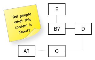
Reading this content model, my eyes are drawn to the question marks. They tell me that content types A and B are works in progress. As a reader, thanks for letting me know and/or may I can help with that.
Summary
So, we have started a simple list of design guidelines to increase the readability of our content models. Remember, they are guidelines, not standards. You can choose to enforce all, none or some of the above. That’s up to you. But whatever you choose to do, be consistent. Why are we doing this again? To move a step closer to making content models standardised work that we all understand and are more proficient in.
Before you go, if you have design guidelines that work for you, please get in touch. I know they’re out just waiting to be shared.
Back to: Content Modelling > Design Guidelines

